
Catalyst Labs Election Analytics
The Problem
Elections are a significant part of every community and organization because it’s an opportunity for a given population to decide how it wants to be led and governed. Voting online has seen an increased demand with the advancements of technology as well. With that in mind, voting online needs to continue to prioritize voter security and efficiency when casting your ballot. Access to results in real-time will also highlight the need for analytics.
How might we give voters a streamlined voting experience while assuring the security of their vote?
How might we provide intuitive and accessible analytics to those that wish to dive deeper into the results?
The Solution
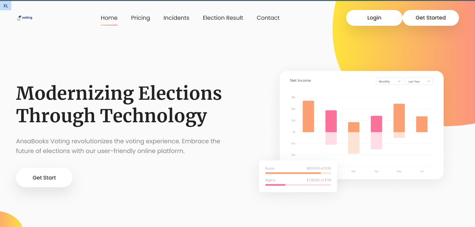
Catalyst Labs OU tasked us with redesigning their website to reduce the friction involved in their voting process and improve their analytics dashboard. Our team delivered a voting process that goes straight from an exclusive voter-unique email to casting their ballot while offering them the option to subscribe to notifications regarding election results and a simpler analytics dashboard if they wish to drill-down into the results.

My Role
I acted as the project lead for the design team, where I handled the communications with the company representative and got everyone on the same page with our strategy and delivery. I constructed the project plan that provided the structure for our team’s objectives and deliverables. I also assisted in competitor research and synthesis, designed the analytics dashboard and election results pages, assisted in the style guide, writing the usability test script, and synthesizing the usability test results.
Starting Out
Since the design team met as a result of this project being formed, we needed to understand each other’s strengths and availability before meeting with the client. I started the conversation by giving my availability and giving some insight into my background as a data analyst. My experience with Tableau and data visualization gave me an opportunity to design an intuitive and versatile dashboard. One of my partners said they weren’t comfortable with talking to the client, so I volunteered to handle communications and take accountability for delivery. Our team agreed to meet with the client once a week for 30 minutes - 1 hour and to meet on our own 2-3 days prior to the projected deadline of every deliverable.
The Initial Call
After introductions, the client gave us the scope of the project: remove the friction from the voting process and redo the analytics dashboard. The company had no attachment to the color scheme used and the results page, so they were open to a complete redesign. The client provided us with login credentials for all user roles interacting with the website, and offered to walk us through the website.
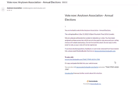
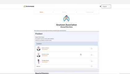
When going through the site, I noticed that the email invites provided were links that included a 16 character alpha-numeric code that was unique to the user. Login credentials were provided for a temporary account as well if need be. From there, the user could simply click the link to be taken directly to their ballot without the need for log-in and could cast their vote in a couple steps. Information was also provided on the election and the candidates when filled in.
The competitors in totality looked like they provided a lot of versatility on setting up elections while keeping things simple for the users, but the analytics for them was limited beyond basic results. We took this into account when we started defining the user flows and sketches.

In our next team call, I brought up the topic of how competitors were omitting creating login credentials entirely and suggested that we propose to the client the feasibility of having a unique link for the user to click that takes them directly to their ballot. The client was on board with this idea, so we were able to omit the create login steps from our voting user flow. We split up the wireframes amongst the 3 of us, so I volunteered to handle the election results and analytics pages.
Wireframes
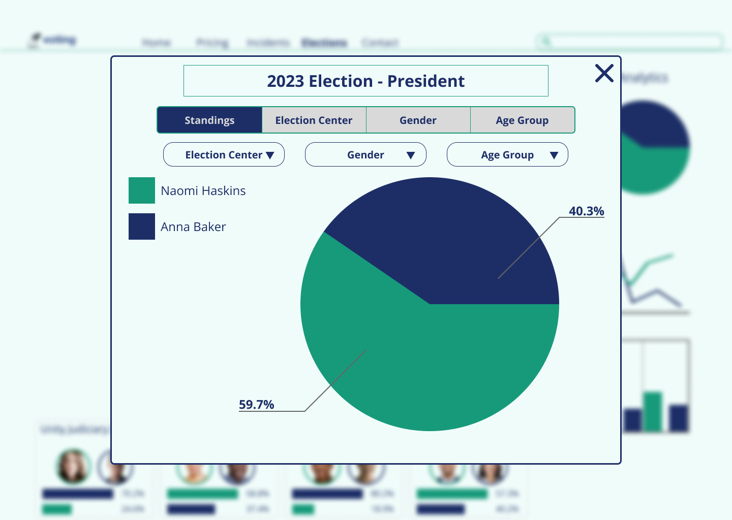
With the Election Results, I had a general idea of how I wanted to keep the page simple and provide analytics. I latched on to the idea of making each graph a pop-up window with filters and parameter selectors to use when enlarged.

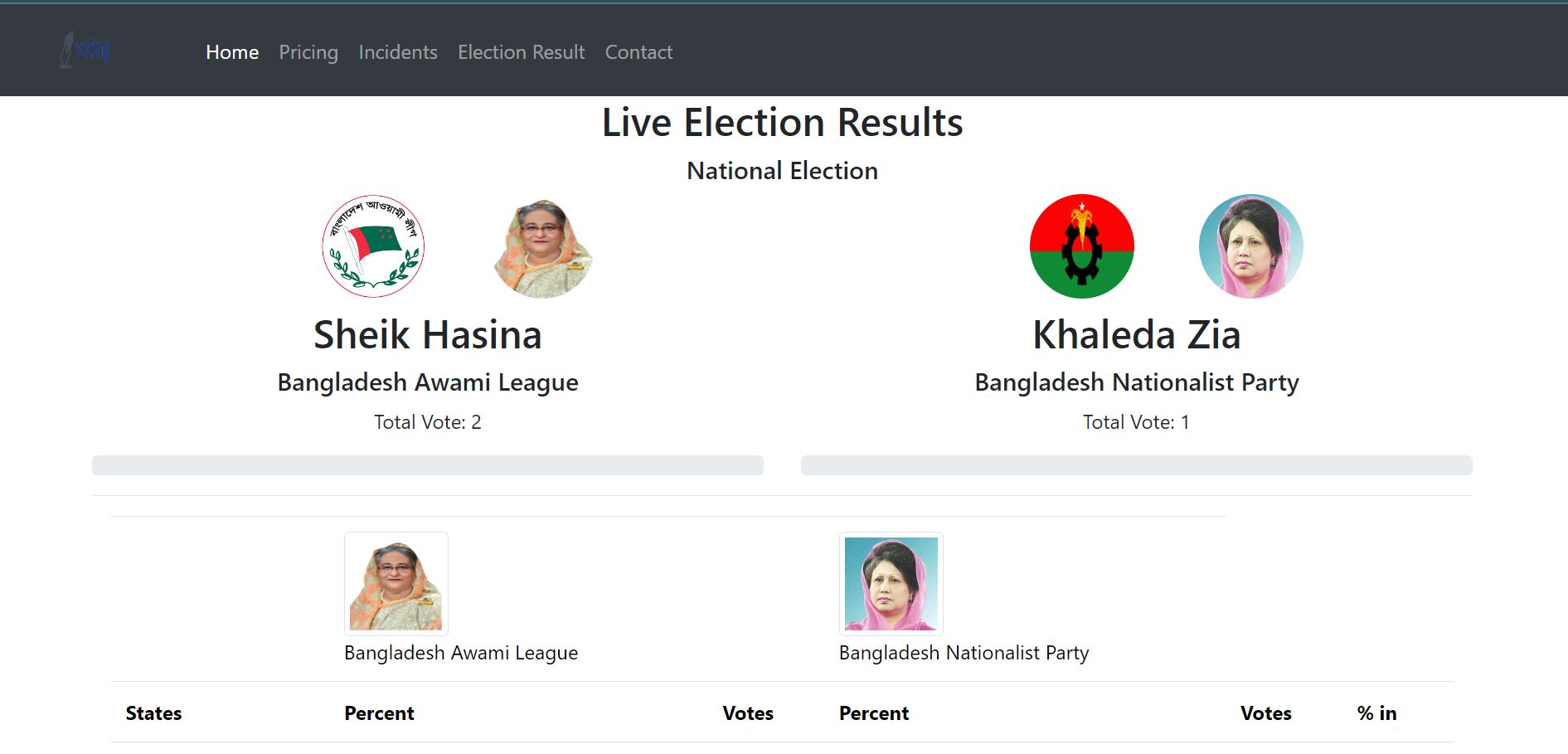
The Election Results Landing Page was a need since the client didn’t have one that preceded the results of an individual election. I created a grid view displaying Live elections at the top with completed elections at the bottom and a search bar option to assist in finding specific elections faster. I limited each election only displaying name, vote count, end date/time, and top 2 standings on this view. This ended up being too heavy for the view, so this was simplified to an extent later on.

Style Guide
With the client being open to colors and fonts, the only thing we had to go on was the “Voting” logo they provided. The color of the text was a dark blue and was in a simple sans serif font, so we used that as inspiration. We decided on Open Sans since it matched the curvature of the characters the most, it was accessible on Windows and Mac, and it happens to have tabular numbers which is perfect for analytics.
One of my partners constructed a green and blue palette that had a minty feel to it, and I suggested a shade of orange for an accent. Through experimentation on finding compliant buttons, we found a red-orange “tomato” shade that accented the palette well and was AA compliant with white text labels.


User Flow
When building out the Election Results user flow, I wanted to give cyclical paths to the user so that they would always have the option to dive into other analytics within the results. I started the user flow with whether they had opted in to email notifications, which we later found out that the client had not considered.
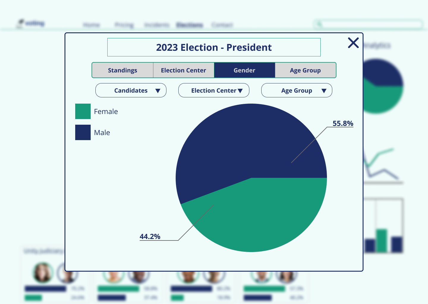
On top of constructing the user flow, I began brainstorming ideas for visualizing the data and how it could be dissected. I kept things simple with a pie chart to observe result standings, tracking votes over time with a line graph, and breaking out votes by multiple elections (assuming voters were voting on more than one thing per ballot). Beyond simple demographics like gender and region, I was worried about votes being potentially reverse-engineered to identify individuals’ votes, so I kept things simple and made sure to bring that up on the next call.
We were shown that the voting process begins with an email invitation to the voter (a list imported by the organization running the election), where they are provided a link to click to set up their login credentials before they vote. The user dashboard was a night-and-day difference compared to the front end of the website, which was disorienting. The Election Results page displayed two sample elections where the results were displayed right away for each election. There were confusing gray bars that held no value and the elections took up a lot of real estate for a landing page.
Our Approach
With 4 weeks to complete this project and only 4 calls scheduled with the client, I broke the timeline down into 6 primary tasks with 4 deliverables:
Project Plan
Research
Wireflows and Initial Sketches
Test Report
Low-Fidelity Wireframes and Wireflow
Hi-Fidelity Prototype and Iterations
Competitor Analysis
Before the second call with the client, we conducted competitor analysis to observe how others had approached online elections. Since the client informed us that their platform would be used for both political and non-political elections, we broadened the scope of our competitors to include a variety. I did my research on a website called Election Buddy, which hosts elections of all varieties. This would be our most direct competitor looked at.


Sketches
One of my partners handled the initial sketches. I took note of their simplistic approach with the analytics and how they ideated a pop-up dashboard for diving into the analytics from the results dashboard.

Building the Prototype
In our wireframes review, the client mentioned how they liked the simple look of the analytics, but was hoping to see options for a gender breakout more front and center. I adapted and simplified the multi-analytics view to add some depth to the pie chart and line graph views. From here, I made parameter buttons that allowed the user to change the color breakout from standings to gender, election centers, country/region, or any other demographic data the organization may import with their voter list.
My partner that worked on the high fidelity screens for the Elections page (different from our Election Results page) simplified the look of mine by removing the analytics from this basic view. I drew inspiration from this and removed the bar charts from the completed election cards to add a “Winner” label. I also removed the total vote labels from every card to further simplify the look.
For the primary color breakouts, I stuck with the Green vs Dark Blue instead of incorporating the Tomato. The Green and Dark Blue have more contrast between them when testing for color blindness, and it gave more emphasis on the use of accents for the Winner labels.
Preparing for Usability Tests
Regarding the user base, the client didn’t have any success with getting their users to fill out our screening survey. We used this opportunity to extend the survey out to a handful of people without limiting to any demographics other than being at least of age to vote and having voted in an election previously. One of my partners synthesized the results into Personas, and I used this information to shape the script. We instructed the users to perform the following tasks:
Cast a vote from the email invitation
Turn on notifications for updates on the election
Find the election results page for the election they voted on
Use the analytics to find gender demographics breakdown on the election results
Feedback and Iteration
Of the 5 usability tests conducted, the users had very little issue completing the tasks. The main issues users ran into were that they couldn’t confirm their vote prior to submitting their ballot, they weren’t sure about how secure their vote was, and they couldn’t tell how far they were through the ballot. We resolved the vote confirmation by adding another page at the end to confirm their vote, and discussed the latter 2 with the client when reviewing the initial prototype.

Speaking of the client, the only feedback for improvement they gave us in this stage was that they’d like to see a table on an election’s page (above the candidates) that breaks out the voter submission counts, rates, and gender breakouts of each. They also wanted to see a stacked bar for the results on this page, so I was able to make some room for it to fit.

One last change I made was to add a “more information” pop-up regarding the information of the election itself. This gave the user the opportunity to see who is running the election and how votes are being collected.

Conclusion and Final Thoughts
Overall, the client was extremely pleased with the final product. They praised the color scheme, the simplicity of the analytics, and the friction reduction from bypassing the need to create login credentials. They also mentioned how the inclusion of opting in for notifications in our design reminded them of the data security and privacy guidelines that they need to abide by in order to operate in the EU.
As for additional improvements, I thought about the idea of implementing a geographic heat map for results in hindsight, but decided that it was best to not include that when this platform is designed to host elections of all varieties. We also did not manage to design a search results page with options to filter on different elements of elections, but the direction for making elections private is up in the air on whether it will be a future installment or not.
I felt good about how I contributed to the project, but it felt weird. Assuming more of a lead role on a group project meant that I didn’t have to have my hands on everything despite taking accountability for every step of the design and delivery. While I prioritized the analytics side of the project in my personal design, I levied the strengths of my partners’ skill sets to show their approach and style. I then built off of that to optimize what they already put in place to build something that I’m truly proud of. I also made sure to inform the client of how each of them contributed to the positive aspects of the design. I look forward to having more leadership opportunities in the future with more projects.